A MODEST PROPOSAL

XXXXXXX, thank you for contacting me. After 20 years of relentless work in the fields of design and illustration it is nice to hear that I am now considered an “influencer.” I’ve heard of brands contacting influencers, such as myself, looking to leverage our Instagram accounts to advertise their goods to an audience that is too savvy to be swayed by standard advertising. In this case it seems that you want me to advertise a design contest to other creative professionals where the winner takes home $10,000 after designing packaging for a major multinational brand valued at over $1 billion. The losers get nothing for their time because they are, after all, total losers.

I’m very familiar with the type of product you’re looking to have designed. Having, in the last several months, completed similar projects for Nike, Google, Coca-Cola, and Ford. Here is what I propose. Instead of asking the creative community to work for free. And instead of getting the type of low quality product that comes from free labor. I suggest you skip the contest and hire me directly. $20,000 should be enough to cover my time and the rights to international usage for one year. $30,000 for a straight buy out. Then once we’re done I can put the completed design up on my Instagram and influence some people to buy it.

I have time to start next week after I wrap a few things up. I look forward to hearing from you.

Dan Stiles

ADVICE FOR GOING SOLO - Part 1

I get a lot of people asking me for advice about striking out on their own. They’re tired of working for the man and they want the creative and personal freedom that comes with being self-employed. They ask about how to get clients, how to come up with ideas, what kind of Wacom tablet to buy. However, none of them ask about one of the single most important aspects of self-employment. Insurance.

Let me start with an analogy. Let’s say your career is like the ocean. You can cross that ocean as part of the Navy on a giant ship. This would be like having a paying job at a company. You take orders, do your job, and so does everyone else. If you get hungry, you go to the mess deck, if you get hurt, you go to sick bay, if you hit a storm someone up on the bridge figures out how to get you through it. You are a cog in a well-oiled machine. Now, let’s say you get tired of being that cog and you decide to be one of those maniacs who crosses the ocean solo in a tiny boat. If you get hungry, you’re the cook. If you get sick, you’re the doctor. If the boat breaks you’re the mechanic. If you fall overboard, the whole ship goes down with you. Knowing that, you would plan accordingly. You would pack food, water, medicine, and spare parts. You would consult maps and tide charts and invest in the proper safety equipment. You would make sure everything was in order before setting out. Anything else would be potential suicide.

Obviously what I’m getting at is that going freelance is like sailing across the ocean solo. You have to wear many hats, several of which you might not like, but you have to wear them anyway. One area where I consistently see creative people failing to plan properly is the area of financial preparedness. Not a week goes by where I don’t get a tagged in a message on Facebook for a GoFundMe that goes something like this. “My friend so and so is a great guy/girl. Last week they were out with friends/on vacation/walking down the street and they fell off their motorcycle/got mugged/got diagnosed with some awful disease. They need $5000 to cover medical expenses and lost wages because, you know, as an artist they can’t afford insurance.” Let me be frank. Regardless of your age you are in deep denial if you think you’re going to make it for the next 20, 30, 40 years without getting sick or injured. It’s going to happen, and you need to plan accordingly. I made it through my teens, 20s and 30s doing all kinds of dangerous shit without a scratch, then seriously injured myself when I was 40, long after I was done living dangerously. At some point something will happen to you too.  

But you can do something to keep this physical trauma from turning into financial collapse as well. Go get yourself some Obamacare. For anywhere from about $150 to $250 a month you can buy health insurance. It may not cover everything. My surgery still cost me $10k, even with insurance. But without insurance it would have been $100k. It turned a financial catastrophe in to a financial set-back. Getting sick ain’t cheap in America. Insurance is simply a fixed cost of doing business, just like your rent, your equipment, and your electricity. If you can’t come up with that kind of money take a good look at your expenses. If you can afford weed you can afford insurance. If you can afford a motorcycle you can afford insurance. If you can afford cable TV, tattoos, beer, or video games you can afford insurance. Often it’s not so much “can’t” as it is “don’t wan’t to.” I’ve always wanted a fast car. Not a quick car, but a balls out fast one. With what I pay for insurance, savings, and retirement every month I could easily make the payment on anything short of a Ferrari. But if I get cancer a fast car won’t do shit for me and my family. So I continue to drive an old Subaru and pay my insurance bills. If you truly can’t scrape up $150 a month maybe a part time job is in order. Working 3 days a week still leaves 4 other days to paint, design, and make stuff. Or maybe going solo isn’t right for you at this point in time. Keep your day job and do more freelance/painting/furniture making at night to build up your client base. Don’t set out on your voyage only partially prepared.

Medical insurance is the most important thing to have in place, but there are other financial considerations as well. Do you intend to GoFundMe your retirement too? Someday you will be old and tired. You may still be working, you may love what you do and do it until the day you die. But if you can’t afford to be sick now what makes you think you’ll be able to afford it then? Do you really want to be living hand to mouth when you’re 85? Thus another fixed cost of self-employment is going to be some kind of retirement fund. A few hundred bucks a month, every month, starting in your 20’s and you’ll be a millionaire by the time you retire. Remember, you’re going solo. Nobody tells you what to do, but nobody is going to bail you out either.

Another thing to think about, especially if you have dependents, is disability insurance. If you’re so fucked up that you can’t work then bills will begin to pile up. Self-employed people do not qualify for any government unemployment assistance or disability. Get a plan that will give you cash every month to keep the lights on. You should also consider life insurance. If your family loses a breadwinner that will be a significant ongoing financial burden for them.

Last but not least you need an “oh shit” fund. I call mine the “zombie apocalypse fund.” It is a stash of cash that you tap into in the deepest of emergencies when only money will avert the apocalypse. Things that do not qualify: credit card bills, braces for your kid, a new TV. Basically anything you “want” instead of “need.” Things that do qualify: Eviction notices, cancer treatment, your house burning down. Be your own GoFundMe. Just like old age and sickness, something shitty and expensive is going to happen to you eventually. Don’t let it sink your little boat.

I know all this makes me seem like a square-ass bummer of a guy, but it’s the reality of working for yourself. You are your own safety net. Insurance is a part of running a business, Just this week I added liability insurance to the suite of insurances I carry. Hopefully I never need it, but if I do I’ll still be in business when the emergency passes, not bankrupt and picking up the pieces of my career. Setting all this up doesn’t need to be a pain in the ass. Call an insurance broker, it’s what they do. They can set you up with what you need and what you can afford. Yes, it’s expensive, and no you won’t use it everyday, but the other choice is flying without a net and face-planting into the sidewalk when the inevitable emergency arises. When I started out on my own I went a talked to a broker that set me up with medical, life, and disability insurance as well as an IRA. I still carry those plans, with certain changes and additions, to this day. You can pay out every month for insurance, or periodically get nailed with $5,000 to $500,000 disasters. Being self-employed, whether you’re a painter, a writer, or a blacksmith means taking care of all the aspects of your business, not just the creative part.

And while you’re thinking of it, email your congressperson to demand single payer healthcare.


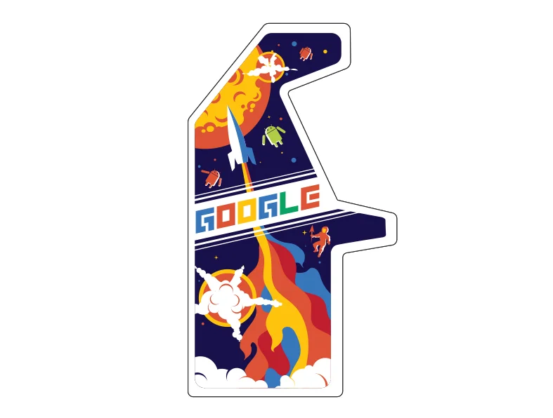
GOOGLE ARCADE PROCESS - Part 2

See Part 1 here

TYPOGRAPHY:

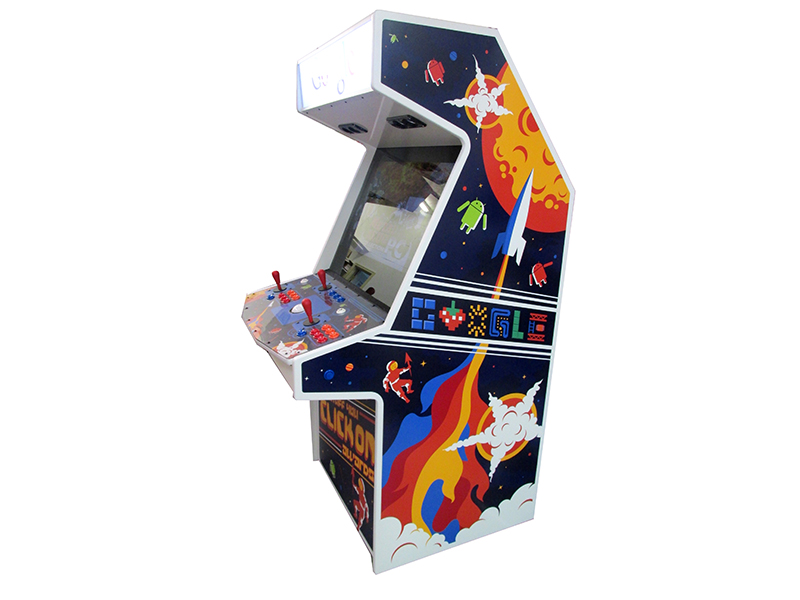
I wanted the type to have that retro game title feeling, line Zaxxon or Dig-Dug. It needed to be custom and done in a style that complimented the rest of the art.

I figured doing the type would be cinch. Google is notoriously lax about their logo, right? Just look at all the Google Doodles that beat the crap out of their brand. I started developing a bunch of custom type treatments that I thought looked like retro games. For instance these two.

It turns out Google isn't lax about their brand at all. Re-typesetting their name in any other typeface is strictly verbotten. No matter what I tried it was rejected by the brand police. However, it turns out you can replace letters with images. So in the end I replaced all the letters with images. It wasn't the game title I was originally looking to do, but it kept with the retro gaming look a whole lot better than the actual Google logo which wouldn't have matched the rest of the art.

THE REAL TYPOGRAPHIC PROBLEM:

Google created these machines in order to give them away as awards. Instead of trophies or plaques, companies that created award winning online advertising would get one of these in their lobby. Pretty cool right? At the onset of the project they hadn't nailed down the name of the award yet. I was expecting something like The Webby, or the Addy awards. Turns out they came up with The Stuff You Click On Awards. Deliberately long titles are funny, and that's why they did it. However, typographically it was a problem. Games have short punchy names. Pac Man, Galaga, Battlefield. Not The Game Where You Drive Tanks Around A Maze And Shoot At Each Other. Fitting all of that verbiage on the side of the cabinet would take up most of the space, and generally the longer the name the less you can mess with the type because you need to maintain legibility.

I eventually worked out a solution similar to what worked for Star Wars The Empire Strikes Back. I used different levels of typography within the word mark itself. Additionally I placed the name of the award only on the kick plate on the front of the machine. On the sides we went with my Google type.

Google wanted their real logo to appear on white somewhere on the machine, so I relinquished the marquee to their branding. As with most cases of applied corporate branding it doesn't stylistically match with the rest of the graphics or fit the space particularly well. But I was already pushing my luck with the logo police, so I gave up that real estate in spite of the fact that graphically it breaks the retro game illusion.

Note, we did wind up having to update those marquees with the new logo after the machines were already finished.

GOTCHA! JOURNALISM

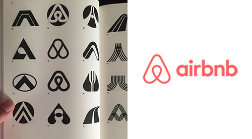
We live in an era when all the information that has ever existed is now at our fingertips. While this serves as a great resource for inspiration and a deep well for plagiarism, it also serves as an endless wellspring for annoying gotcha journalism. Recently Facebook has light up with posts about the Airbnb logo being found in an old logo book.

There are three ways this kind of thing happens:

1) It was a lift. It's very tempting when flipping though an old design book or the internet to spot your solution already fully formed and ready to go. Instead of going through the painful process of creating something from nothing, you can start the process 90% finished and simply brush up the colors and shape. This is a bad idea. Not only is it intellectually lazy, but you're gonna get caught. That said, people do it ALL THE TIME. And not just with logos. The hardest part of any design process is the concept and initial form development. Some designers and artists have made whole careers out of lifting stuff and most of us have tried it at least once. Much of the advertising you see consists entirely of reusing other people's ideas, songs, and images.

LEFT: My Edward Sharpe poster, 2012RIGHT: Larnake Art Festival, 2015 

LEFT: My Edward Sharpe poster, 2012
RIGHT: Larnake Art Festival, 2015


2) It was "inspired by" the original. This is not the case here, as the two designs pretty much match. But every artist and designer knows exactly what I mean when I say that sometimes you see something and it inspires you to make something similar. That's how art works. Almost nothing is created in a vacuum. The goal here is to be inspired, but then create work that no longer looks like the original. Want to draw with squares like Piet Mondrian? Awesome, go nuts. But don't just make a grid of yellow, blue, and red. Do something else with the idea.

Picasso and the Cubists were inspired by African art.LEFT: Pablo Picasso, 'Head of a Woman', 1907 (oil on canvas)RIGHT: Dan tribal mask from West Africa

Picasso and the Cubists were inspired by African art.
LEFT: Pablo Picasso, 'Head of a Woman', 1907 (oil on canvas)
RIGHT: Dan tribal mask from West Africa

LEFT: My Ski Colorado poster, 2012RIGHT: Johnny Cupcakes T shirt, 2015I’m on the fence about this one. Obviously they didn’t just trace my design. On the other hand, the entire concept, layout, angles and textures are all remarkably similar to mine.…

LEFT: My Ski Colorado poster, 2012
RIGHT: Johnny Cupcakes T shirt, 2015
I’m on the fence about this one. Obviously they didn’t just trace my design. On the other hand, the entire concept, layout, angles and textures are all remarkably similar to mine. Inspired by or ripped-off? My design was obviously inspired by vintage travel posters, which was what the client asked for.

3) It was simply a coincidence. There are no new shapes in the world. Let me be clear about that. All the shapes and colors already exist. Sometimes you can combine them in novel ways, but 99.99% of the time if you dig back far enough you can find pretty much the same thing somewhere else. For example:

TOP LEFT: Beats by Dre logo 2012TOP RIGHT: A logo I made in 1998 for a now defunct tech company, nearly 15 years before the Dre logoBOTTOM LEFT AND RIGHT: Old logos from the 1960's out of a logo book

TOP LEFT: Beats by Dre logo 2012
TOP RIGHT: A logo I made in 1998 for a now defunct tech company, nearly 15 years before the Dre logo
BOTTOM LEFT AND RIGHT: Old logos from the 1960's out of a logo book

In the end the issue is a little more complicated than simply pointing a finger and saying "You stole that!" Maybe they did, maybe they didn't. But the internet isn't known for it's sense of nuance, is it?

DAN STILES ON ADVENTURES IN DESIGN

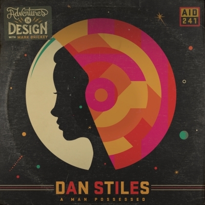
Last week I got a chance to chat with my dear friend Mark Brickey on his Adventures in Design podcast. Mark and I go way back, I met him almost 10 years ago at Flatstock. We used to stay up late every night, sitting next to the pool and talking shop. Our conversations have always come easy. He has an excellent mind for both design and business, which is a rare combination. These days he makes his living those conversations on the air. This episode is free for the next month, then it goes behind the paywall.

UPDATE: Here is an easier link to use

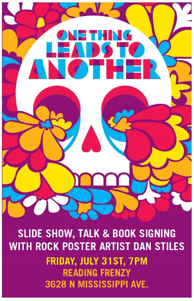
SLIDE SHOW AND BOOK SIGNING TONIGHT - READING FRENZY PDX

Hey everyone, I'm doing a little thing at Reading Frenzy on Mississippi tonight at 7pm. The last event of my book tour. I'll be giving a slide show of things I've learned over 20 years of going from broke-ass artist to not quite as broke-ass artist.

BLACK METAL KITTEH T's ARE HERE

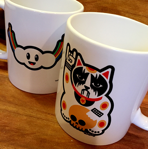
Hail Satan! My corpse paint Maneki-neko design is now available as a Tshirt for your summer wearing pleasure. 

$30.00

White, red, and yellow on a BLACK SHIRT

High quality fitted T with a 3 color design on the chest.

WOMEN’S SHIRTS RUN REALLY SMALL. SEE CHART.

SIZE:
Quantity:
Add To Cart

INTERVIEW WITH THE WILD MAGAZINE

Dan Stiles Talks Art in the Digital Age

It’s not uncommon to see creative minds coming together to combine different forms of art. However, musicians would not be where they are today without the artists who’ve created the visual representations of their sounds. Here at the WILD, we were lucky enough to chat with graphic artist Dan Stiles, who, in addition to writing and illustrating multiple books and developing a substantial portfolio of non-music-related art, has also become known for creating tour posters for bands like Of Monsters and Men, Tame Impala, ODESZA, and more...

See the rest of the article HERE

PIMPIN' FOR WACOM

I have an ongoing relationship with the folks at Wacom. I started using a tablet about 15 years ago, and it had a  profound effect on my work. A year or two ago Wacom approached me to test and review some of their new products. Here is a short video they did of me using the Cintiq Hybrid Companion.

Deathburger Tshirts back in stock

After selling out the entire first run at SXSW I have a new box of Deathburger shirts ready for your hot sweaty summer bod. Lots of people have asked where the idea came from, and to be honest I don't remember. I've been drawing this thing in various forms in my sketchbook for months and months. I finally got it to a place where I think it works in the spring.

SIZE:
Quantity:
Add To Cart