
The folks at Screenprinting magazine have featured on of my electric posters on their esteemed pages. >CHECK IT OUT

AUDIO POSTER PROTOTYPE
Workin' on some new stuff in the design lab. Stay tuned for more...
DAN STILES SQUANCHES RICK AND MORTY
Officially licensed poster for Cartoon Network's Rick and Morty. Part of their Gallery 1988 show. You can still buy one through the gallery >HERE

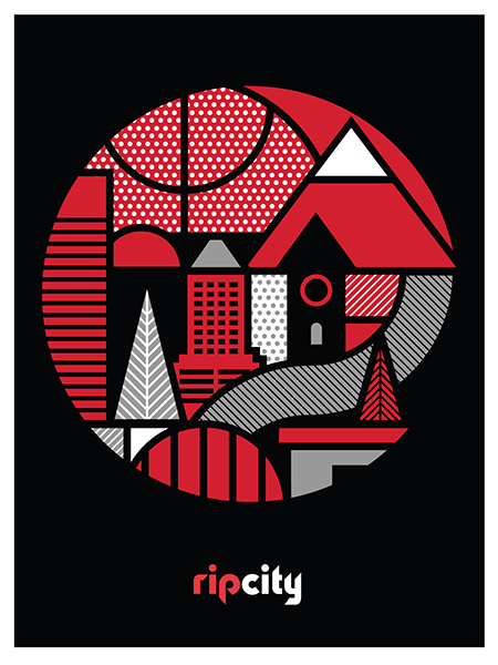
DAN STILES V. PORTLAND TRAILBLAZERS
This official limited edition serigraph was commissioned by the Portland Trail Blazers as an exclusive gift for their closest partners. Inspired by Portland landmarks, the spirit of Rip City and the pebbles and seams of a basketball. Printed in 2016 using official Trail Blazers team colors in a limited edition of 150, each print is hand-signed and numbered by the artist.
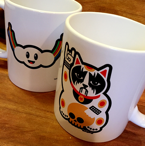
WHAT'S BETTER THAN COFFEE?
Coffee in a Dan Stiles mug, that's what. Start your day with a big "fuck the world." Available at the #pdxpopupshops, and hopefully on my website soon, once I get to it.
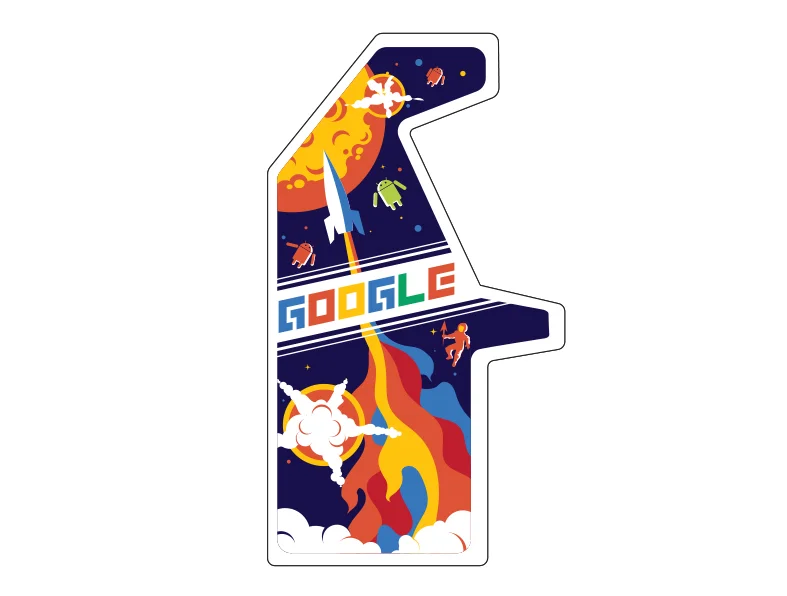
GOOGLE ARCADE PROCESS - Part 2
See Part 1 here
TYPOGRAPHY:
I wanted the type to have that retro game title feeling, line Zaxxon or Dig-Dug. It needed to be custom and done in a style that complimented the rest of the art.

I figured doing the type would be cinch. Google is notoriously lax about their logo, right? Just look at all the Google Doodles that beat the crap out of their brand. I started developing a bunch of custom type treatments that I thought looked like retro games. For instance these two.

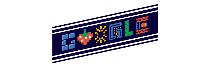
It turns out Google isn't lax about their brand at all. Re-typesetting their name in any other typeface is strictly verbotten. No matter what I tried it was rejected by the brand police. However, it turns out you can replace letters with images. So in the end I replaced all the letters with images. It wasn't the game title I was originally looking to do, but it kept with the retro gaming look a whole lot better than the actual Google logo which wouldn't have matched the rest of the art.
THE REAL TYPOGRAPHIC PROBLEM:
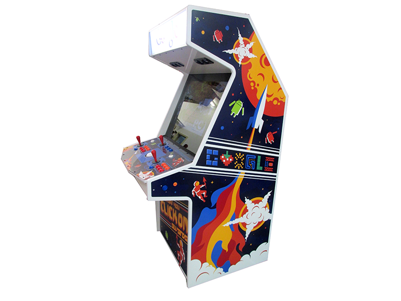
Google created these machines in order to give them away as awards. Instead of trophies or plaques, companies that created award winning online advertising would get one of these in their lobby. Pretty cool right? At the onset of the project they hadn't nailed down the name of the award yet. I was expecting something like The Webby, or the Addy awards. Turns out they came up with The Stuff You Click On Awards. Deliberately long titles are funny, and that's why they did it. However, typographically it was a problem. Games have short punchy names. Pac Man, Galaga, Battlefield. Not The Game Where You Drive Tanks Around A Maze And Shoot At Each Other. Fitting all of that verbiage on the side of the cabinet would take up most of the space, and generally the longer the name the less you can mess with the type because you need to maintain legibility.
I eventually worked out a solution similar to what worked for Star Wars The Empire Strikes Back. I used different levels of typography within the word mark itself. Additionally I placed the name of the award only on the kick plate on the front of the machine. On the sides we went with my Google type.

Google wanted their real logo to appear on white somewhere on the machine, so I relinquished the marquee to their branding. As with most cases of applied corporate branding it doesn't stylistically match with the rest of the graphics or fit the space particularly well. But I was already pushing my luck with the logo police, so I gave up that real estate in spite of the fact that graphically it breaks the retro game illusion.

Note, we did wind up having to update those marquees with the new logo after the machines were already finished.
GOOGLE ARCADE PROCESS - Part 1
Periodically a dream job lands in my lap. In this case it was designing classic stand up arcade game cabinets for Google. How did I get the project? As usual, they found me, I didn't find them. They saw some of my previous work and figured I was the right guy for the job.
THE BRIEF:
As with many of my projects, the brief was pretty loose. "The design of the arcade cabinet should be bright fun and “Googley.” Design elements should convey the spirit of retro gaming with a modern flare. Avoid any actual game characters but think of all the classic themes. Love your style, this is a fairly open brief and should be a lot of fun." That was pretty much it.
MY PROCESS:
In order to not drive myself insane I gave myself some structure to work within. The best thinking usually comes from working within restrictions. Being a child of the 70's and 80's I distinctly remember the first Pac-Man game that was installed at the bowling alley by my house. Then over the next year or two several arcades popped up in the neighborhood. Video game cabinet art was always a dramatization of the game itself. In contrast to the simplistic 8 bit graphics of the games the cabinets were usually wildly elaborate renderings that resembled the back glass from pinball machines.
In light of this, my process started with this thought. If I was 10 years old and a new game called GOOGLE showed up in the arcade one morning, what would the premise of that game be? Would it be a shooter? A maze? A space battle? What would the internet look like as a game in the 80's? My first step was to come up with some simple game ideas. For instance maybe you're a guy who surfs in outer space on a giant arrow, maybe you're a glove character that runs around pressing buttons that open portals? Perhaps you fire rockets shaped like pointers at alien attackers? Once I knew what the games were then I could try to depict them.
My next step was to print out a bunch of blank cabinets and sketch on them. Quick and rough tests to see which ideas had merit. For instance here are the glove and the rocket ideas.

Once I had a couple of ideas I liked I built several rough comps in Illustrator to share with the client. Here are a couple of examples. On the left is a game where you blast shapes (that spell GOOGLE) out of the sky with pointer arrow rockets. On the right is the glove character that I mentioned above.

After the presentation I took the client's feedback and decided to take attributes from several of the favored designs and combine them into one illustration. The rocket came from one design, the explosions from another, and the shapes in the sky were replaced by Android aliens. This basic design formed the platform for the finished product.
Tune in next week for the dramatic conclusion of this project in Part 2
NEW WILCO POSTER IS IN THE SHOP
Wilco in Bend, OR Aug 8, 2015. Due to the tight timing on this one the copies that were sold at the show are not signed and numbered. My copies are the only signed ones available.

LET'S HAVE A POSTER DROP!
A bunch of stuff is now available on my site! Including my new one for The Black Keys. As well as The Decemberists, and this year's Squamish Music and Arts Festival poster.


BLACK METAL KITTEH T's ARE HERE

Deathburger Tshirts back in stock

After selling out the entire first run at SXSW I have a new box of Deathburger shirts ready for your hot sweaty summer bod. Lots of people have asked where the idea came from, and to be honest I don't remember. I've been drawing this thing in various forms in my sketchbook for months and months. I finally got it to a place where I think it works in the spring.
LOVE BOTTLE
Congrats to Minna Yoo and her team at Love Bottle. Can't wait to see one in person. These bottle will be available at Made in Oregon, Zupans and other select locations.
NEW SITE LAUNCHES

Finally got around to getting a new site. It's bigger, brighter, and easier to find the latest posters and events I'm speaking at. Oh it also has an archive! The Vault is the collection of posters I've designed over the years, there's even a search feature which is pretty cool.
Thanks to The Study for helping to make this happen.